What have you learned from your audience feedback?
Below is the video I created for question 3 of the evaluation.
Here is the script I used for question 3:
The following clip shows me asking two of my class mates a few questions on my music video.
From the footage, you can see that it received positive feedback from my peers. I collected feedback from a total of 42 people, and created graphs so it is clear to see my feedback. Overall, I achieved mostly 3's and 4's for each question.
I was interested to see what comments people wrote about my film and what they thought I could do to improve. One person said 'It would be better if you chose more of a vaired choice of locations'. I feel like this is a fair comment, as although I used different parts of the house and a few outside shots, the start of the narrative is filmed at the same place which may slightly effect the continuity of my video.
One person also gave me a 1 for the question 'How clear was the meaning?', but 25 people gave me a 4, which shows that my music video may not be to all musical tastes.
Other comments I received were 'good use of special effects', 'I loved all the shot edits with different transitions', 'good source of fun', and 'straight to the point, meaning shone through'. I am of course very happy with these comments and am pleased that the majority of people liked my video.
Here are a few graphs showing feedback I received for the question 'Was the lighting appropriate?', 'How varied were the shots?' and 'Was there appropriate use of special effects?' The questions were rated 1 to 4, with 1 being the lowest and 4 being the highest. As you can see, my feedback has been quite positive.
The majority rated the appropriatness of the lighting as a 3, with 4 being second highest.
20 people rated the variety of my shots as a 4, while only 5 rated it as a 2.
And finally, 24 people rated the special effects as a 3.
From analysing my feedback, it is clear to see that although my film received positive feedback, there were areas where I could have improved, such as the variation of my locations.
Overall, I am very happy with the feedback I received.
Thursday, 31 March 2011
Friday, 25 March 2011
Evaluation Question 2
How effective is the combination of your main product and ancillary texts?
Below is the video I created in answer to question 2.
Here is the script I used for the voice over.
Hello, I'm Charlotte McHale and this is the music video I created for 'Teenage Kicks' by The Undertones. The Undertones are a punk rock / new wave band from the 70's.
Below is the video I created in answer to question 2.
Here is the script I used for the voice over.
Hello, I'm Charlotte McHale and this is the music video I created for 'Teenage Kicks' by The Undertones. The Undertones are a punk rock / new wave band from the 70's.
When I began thinking of different themes and designs for my media products, I decided I wanted it to have an ‘indie’ theme. To achieve this, I made sure I featured shots of the band, a story line, and a fun element to the video. The look I was trying to achieve was that the band were new and upcoming, and ‘Teenage Kicks’ was their first music video, so therefore looks low-budget. I wanted the band to look like they were in band practice to give a laid back appeal. The narrative features a boy who falls in love with a girl he see's, and about what they get up to, basically everything a teenager is stereotypically supposed to do. I feel that this narrative strongly links in with the lyrics of the song.
Inspiration for my video and my ancillary texts came from looking at other music videos and digi-pak’s, such as Vampire Weekend, Mystery Jets, The Smiths and Blondie. Their photo’s and designs are simplistic and can be quite cold looking, and this is conventional for an 'indie' theme. The music video, such as ‘Young Love’ by the Mystery Jets, has a fun, laid back feeling to it. I tried to achieve this in my music video and other products.
My digi pak works well with the theme of my music video, as the pictures used are simplistic and bold, which fits in well with the indie theme. I also used a few still’s from my video which links the digi-pak and the video together. I took lots of photos of the girl in my music video in a dark studio, and I feel although it may not be very similar to the film, I feel that by using a dark background and harsh lighting on her represents teen rebellion, and I also have her smoking in one of the pictures which further emphasizes this theme. I decided to have the CD in the style of a record. I did this as it gives a vintage feel, and also because it fits into the time period of the song.
My poster works well with my music video as it is straight to the point and shows that the band is new and starting their first tour, and this is the theme I was aiming for in my film. I feel that my poster also works very well my digi-pak, as the background is black and features the front cover of the album. It is simplistic, bold and eyecatching. I have added quotes about the band underneath in yellow so that they stand out against the black back ground. The picture I used for my front cover is a direct mode of address, and I feel it is very eyecatching, and this is a good factor for a poster as it grabs people attention.
The digi-pak and the poster compliment each other very well, as the font is the same on both of them, and it is big and bold. Also, the background colour is black, which is the same as the panels on the digi-pak and the lighting is similar on both also. My video may not be as dark as the digi-pak or poster, but it still has a teenage factor to it with smoking, sexua references and a laid back, fun feel to it. I feel all three media products work well together, as they all portray teenage adolescents in a new and upcoming band.
Tuesday, 22 March 2011
Evaluation Question 1
In what ways does your media product use, develop or challenge forms of conventional media products?
For the first evaluation question, I have decided to take 9 screen shots from my music video that I feel may or may not use the conventions of music videos.
 (Click to enlarge)
Frame One.
In the first frame, it shows a close up of a fret board with the lead singer playing it. This is a very conventional shot, as many music videos use it, especially videos featuring bands. I decided to frame the shot in this way as it shows the band playing the instruments, and it is very typical of a video in the 'indie' genre.
Frame Two.
In the second frame, it shows the lead singer leaning against the wall lighting a cigarette at the bottom of a block of flats. This gives the shot an informal look. The lighting of the cigarette is a conventional factor to an 'indie' music video, as it connotes youth rebellion. I used this shot as it gives the viewers an idea of what the lead singer is like.
Frame Three.
In the third frame, it shows the whole band performing together. It isn't professional looking; it looks more like band practise. I feel this is slightly different to the usual convention of a band performing, as normally it would look more professional with lighting and a stage. I decided to make it look more like a band practise, therefore giving it the feel of a new and upcoming band that was possibly on a budget while filming.
Frame Four.
In the fourth frame, it shows a split screen of one of the band members passing a phone 'through the screen' and holding it to the lead singers ear. It was done through different levels of zoom, and while the lyrics 'I'm gonna call her on the telephone' are heard. There are conventional and unconventional parts to this frame. I feel that the 'passing the phone through the screen' part is quite different, as I have never seen it before, whereas the link between the words and the video is regularly seen in a lot of music videos. I feel like this is a twist on a regular convention.
Frame Five.
In the fifth frame, it shows a close up of a guitar. This is a typical convention of a music video belonging to a band, as it is displaying instruments the band play. I decided to use this so the viewers can see the singer play the instrument. It also fits in with a chord change, which helps the video run smoothly and links what the viewer see's to what they hear.
Frame Six.
In the sixth frame, it shows one of the band members playing the drums. This again fits with the conventions of an 'indie' music video as it shows other band members. I decided to do this because it shows and promotes other band members, not just the lead singer. It also shows other instruments being used.
Frame Seven.
In the seventh frame, it shows a split screen which is split into two ways. In each screen is something different: a band members body and guitar, the head of the lead singer and the foot of the drummer on a pedal. Split screens are quite conventional in music videos as it lets the director put different shots in the same frame. It is also something different for the viewer to look at. I decided to use split screens in my video quite a bit, as it gave me the chance to put all the band members in the same frame and provided a different view from the usual single frame.
Frame Eight.
In the eighth frame, it shows the lead singer putting a pair of socks down his jeans. This is part of the narrative, and narratives in music videos are very popular, although i do not think this particular story line has been done before! The sexual connotations are very conventional to music videos, however, not so much in 'indie' music videos. I therefore feel I have developed the universal convention by using it in my 'indie' music video. I decided to use this shot as I feel it adds humour to my video, making it less serious.
Frame Nine.
In the final frame, it shows all the band and the girls in a bed and they all jump forward, cheer and wave their hands. I feel this adds a fun ending to my video. I do not think it is very conventional. Conversley, in the frame I feature the song title and the name of the band, and this is very conventional across all genres of music video.
Over all, I think I have used a lot of conventional aspects in my video. However, I feel that in some cases I have developed them and for that reason I feel that my music video is quite unique in some aspects, while still fitting into the 'indie' genre.
For the first evaluation question, I have decided to take 9 screen shots from my music video that I feel may or may not use the conventions of music videos.
Regular conventions seen in music videos.
Conventions you may expect to see in most music videos would be sexualisation of women and sexual connotations, dancing, special effects, the name of the song at the start and end of the video, and shots of the singer/band.
I would place my music video in the 'indie' genre of music video, and this type of genre has it's own conventions, such as a story line, shots of the band/singer and shots of instruments.
Below are my 9 frames I picked from my video:

Frame One.
In the first frame, it shows a close up of a fret board with the lead singer playing it. This is a very conventional shot, as many music videos use it, especially videos featuring bands. I decided to frame the shot in this way as it shows the band playing the instruments, and it is very typical of a video in the 'indie' genre.
Frame Two.
In the second frame, it shows the lead singer leaning against the wall lighting a cigarette at the bottom of a block of flats. This gives the shot an informal look. The lighting of the cigarette is a conventional factor to an 'indie' music video, as it connotes youth rebellion. I used this shot as it gives the viewers an idea of what the lead singer is like.
Frame Three.
In the third frame, it shows the whole band performing together. It isn't professional looking; it looks more like band practise. I feel this is slightly different to the usual convention of a band performing, as normally it would look more professional with lighting and a stage. I decided to make it look more like a band practise, therefore giving it the feel of a new and upcoming band that was possibly on a budget while filming.
Frame Four.
In the fourth frame, it shows a split screen of one of the band members passing a phone 'through the screen' and holding it to the lead singers ear. It was done through different levels of zoom, and while the lyrics 'I'm gonna call her on the telephone' are heard. There are conventional and unconventional parts to this frame. I feel that the 'passing the phone through the screen' part is quite different, as I have never seen it before, whereas the link between the words and the video is regularly seen in a lot of music videos. I feel like this is a twist on a regular convention.
Frame Five.
In the fifth frame, it shows a close up of a guitar. This is a typical convention of a music video belonging to a band, as it is displaying instruments the band play. I decided to use this so the viewers can see the singer play the instrument. It also fits in with a chord change, which helps the video run smoothly and links what the viewer see's to what they hear.
Frame Six.
In the sixth frame, it shows one of the band members playing the drums. This again fits with the conventions of an 'indie' music video as it shows other band members. I decided to do this because it shows and promotes other band members, not just the lead singer. It also shows other instruments being used.
Frame Seven.
In the seventh frame, it shows a split screen which is split into two ways. In each screen is something different: a band members body and guitar, the head of the lead singer and the foot of the drummer on a pedal. Split screens are quite conventional in music videos as it lets the director put different shots in the same frame. It is also something different for the viewer to look at. I decided to use split screens in my video quite a bit, as it gave me the chance to put all the band members in the same frame and provided a different view from the usual single frame.
Frame Eight.
In the eighth frame, it shows the lead singer putting a pair of socks down his jeans. This is part of the narrative, and narratives in music videos are very popular, although i do not think this particular story line has been done before! The sexual connotations are very conventional to music videos, however, not so much in 'indie' music videos. I therefore feel I have developed the universal convention by using it in my 'indie' music video. I decided to use this shot as I feel it adds humour to my video, making it less serious.
Frame Nine.
In the final frame, it shows all the band and the girls in a bed and they all jump forward, cheer and wave their hands. I feel this adds a fun ending to my video. I do not think it is very conventional. Conversley, in the frame I feature the song title and the name of the band, and this is very conventional across all genres of music video.
Over all, I think I have used a lot of conventional aspects in my video. However, I feel that in some cases I have developed them and for that reason I feel that my music video is quite unique in some aspects, while still fitting into the 'indie' genre.
Wednesday, 16 March 2011
Designing my Poster
After I completed my Digi-Pak, I needed to create a poster that would advertise it.
I had a rough idea of what I wanted to do with my poster. Originally I wanted to use a picture of a bus stop advertisement or billboard as a template, but I later decided it would be better to create a poster that could be featured in a magazine or put up on the wall, or on a website of a music venue.
I decided to additionally put dates and venues of an upcoming tour promoting the album on the poster, as I felt that the target audience would be the type to enjoy going to gigs. They would also buy music magazines, therefore have more chance of seeing the advert.

When I created my first draft of the poster, I featured a picture of the lead singer at the top, and a smaller picture of the front cover of the Digi-Pak under the tour dates. However, after I finished it, I decided that the poster was promoting the tour more then the album itself, so to make the Digi-Pak more prominent, I decided to change the picture at the top of the advert, and move the font around and change its size.
Below is the finished product:

I had a rough idea of what I wanted to do with my poster. Originally I wanted to use a picture of a bus stop advertisement or billboard as a template, but I later decided it would be better to create a poster that could be featured in a magazine or put up on the wall, or on a website of a music venue.
I decided to additionally put dates and venues of an upcoming tour promoting the album on the poster, as I felt that the target audience would be the type to enjoy going to gigs. They would also buy music magazines, therefore have more chance of seeing the advert.

Below is the finished product:

I feel that by doing this, it is promoting the album and tour equally, as your eyes are drawn to the picture, and under it is information of when the album is coming out and where you can purchase it.
Under it is the tour for the new album with dates, and comments from some DJ's and a few lines about the albums success.
Overall, I am pleased with the outcome of my poster.
Monday, 7 March 2011
Panels for my Digi Pak.
In this post are my panels for my Digi-Pak.


This is my front cover for my Digi-Pak. I am pleased with the out come, as it is quite simplistic, yet grabs your attention. I wanted to use a plain background as well, so the main focus is the girl in the picture and then the text. It is similar to the front covers that I studied for my research, although I feel I have added a small twist to it by having her at the side of the shot and holding her head instead of standing face on to the camera expressionless.

This is the CD for my Digi-Pak. Because the song is from the 70's, I felt that the CD should be in the style of a vinyl record. I feel this is different from what most other people would use for their disk. I chose a plain background, and gave the CD a back shadow to give the effect of it sitting in front of the background. This is again simplistic, which was the effect I was aiming for.

This is one of my panels for my Digi-Pak. I used a still from my video, so it relates to it. I added a picture I took of the girl underneath so that there is a part of all the band in the panel. I decided to use this design because in my video I feature quite a few split screens, so again it relates to my music video.
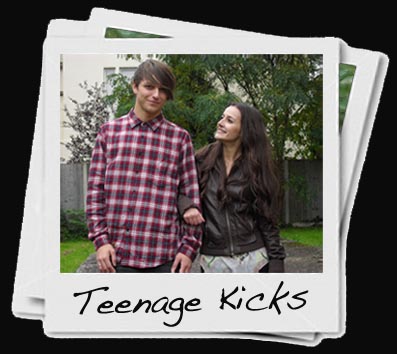
This is another one of my panels for my Digi-Pak. I decided to use a polaroid effect because I feel it brings something different to my Digi-Pak, and also because polaroids are old and retro, like the vinyl, and this again fits in with the choice of song that I used. By adding a picture behind the one that you can see, it gives the effect to the potential buyer that there are photos stacked up underneath it. I used font to add another factor to the panel, and used a font that represented hand writing so it looks like either the boy or girl have written on it.

This is another one of my panels for my Digi-Pak. I decided to design it in this way because the pictures are similar to the front cover, and also because in some of them she is lighting a cigarette and smoking, which is something most teenagers do, and it fits into the title of the song, 'Teenage Kicks'.

This is the back cover for my Digi-Pak. I chose this design because it features the lead singer of the band, and it leaves room for the song titles. I put the song numbers in a white box to give the impression they have been ripped from paper. I tried it with the song titles, but I felt it did not work very well. I feel that the back cover is quite simplistic also, which again fits into the theme of my Digi-Pak and music video.
While making my Digi-Pak I made some changes, for example, I did not stick entirely to my plan I drew up and put on my blog. I felt that they did not fit in with the theme of my Digi-Pak. I feel that the decisions to change them were good, as I am pleased with the out come.
Subscribe to:
Posts (Atom)